

How should you start a presentation? Start your presentation with PUNCH.
In order to establish a connection with an audience, we must grab their attention right from the beginning. A punchy opening that gets the audience's attention is paramount. Granville N. Toogood, author of The Articulate Executive also stresses the idea of starting off quickly and beginning with punch. “To make sure you don’t get off on the wrong foot, plunge right in," he says. "To galvanize the mind of the audience, you’ve got to strike quickly.” There are many ways to strike quickly and start with punch to make a strong initial connection. Conveniently, at least five proven ways to begin a talk form the acronym PUNCH. Some of the best openings include content which is Personal, Unexpected, Novel, Challenging, or Humorous. Some of the best presentations contain at least one or more of these elements.
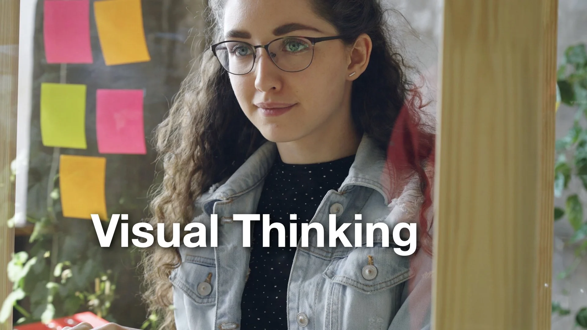
What is visual thinking? How to use it to prepare your work.
Turning words/text into visual representations is a part of visual thinking, but it's only a small part. For example, in the summer of 2007 in a Waikiki hotel—six months before the first edition of Presentation Zen was published—I spent days writing my ideas—mostly in text form—onto sheets of paper before I begin writing the actual book (right). Eventually, those ideas become an outline and then a book, but first I needed to get all the ideas out in a space where I could see the big picture and see how the parts can fit together. I needed to go from the abstract (a new book on presentations) to the concrete (content details plus structure). I knew I wanted ten chapters for the book, so I placed ten large sheets of paper on the wall, and then over several days, I filled in all the sheets (chapters) with a word or two or a crude drawing representing each idea of concept that I wanted to cover.
A Long Time Ago, Before Bad Presentation Slides
Let's embrace the spirit of the Rebel Alliance and push back against Imperial AI slop propaganda and the scourge of habit and conventional wisdom. If you have a large screen, use it to show visuals, not lines of text that remind you what to say. Stand with your visuals, becoming a clear part of the visual experience from your audience's point of view. Do not stand meekly in the corner or behind a lectern, removed from both the audience and the bright screen.

Shinrin‑yoku (森林浴) can change your life.
Forest bathing, or shinrin‑yoku, is a Japanese practice of mindful immersion in nature, a practice that can help us step back from the stress of modern life. It is not about hiking necessarily, but about slowing down and simply being in the forest, engaging all the senses, listening, breathing, and letting the atmosphere wash over you. Research shows that this quiet presence in nature can lower blood pressure, reduce cortisol, and even support the immune system. The practice is beautifully simple: walk slowly, sit quietly, breathe deeply. No special gear or training is needed. Forest bathing is a gentle, accessible way to reconnect with nature, restore calm, and bring a bit of quiet clarity back into our lives.
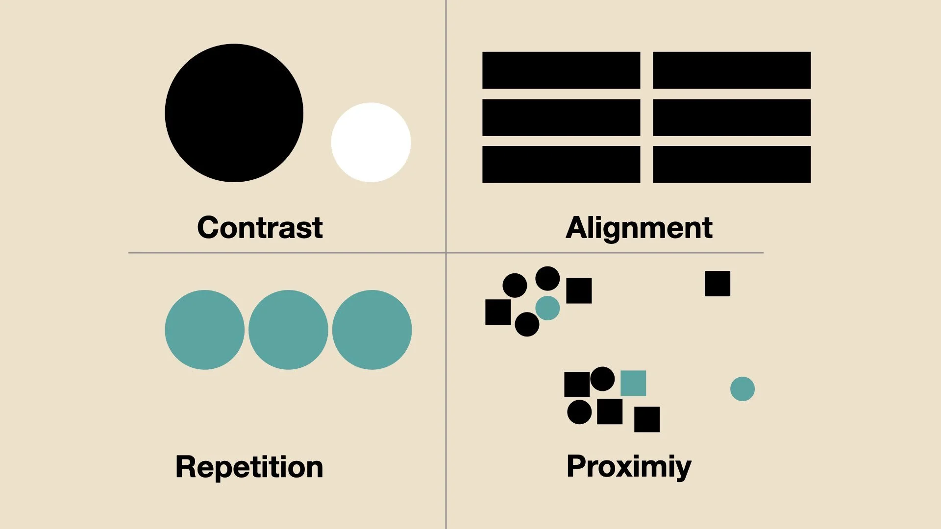
Design Fundamentals: Contrast, Repetition, Alignment, Proximity
Sometime in the mid-1990s, I serendipitously found a lovely book called The Non-Designer’s Design Book by Robin Williams (the designer). As the title implies, this is a book for non-designers who need/want to learn some fundamentals about design that will help them make better graphics. The book focuses on four essential concepts: Proximity, Alignment, Repetition, Contrast. Of course, there is much more to graphic design than these four fundamental concepts, but understanding them can give anyone a solid foundation on which to build. In this post, I share a link to a PDF containing the section (with slide examples) from Presentation Zen that explains these four concepts.
Present with Simple Visuals, Not Dense Text
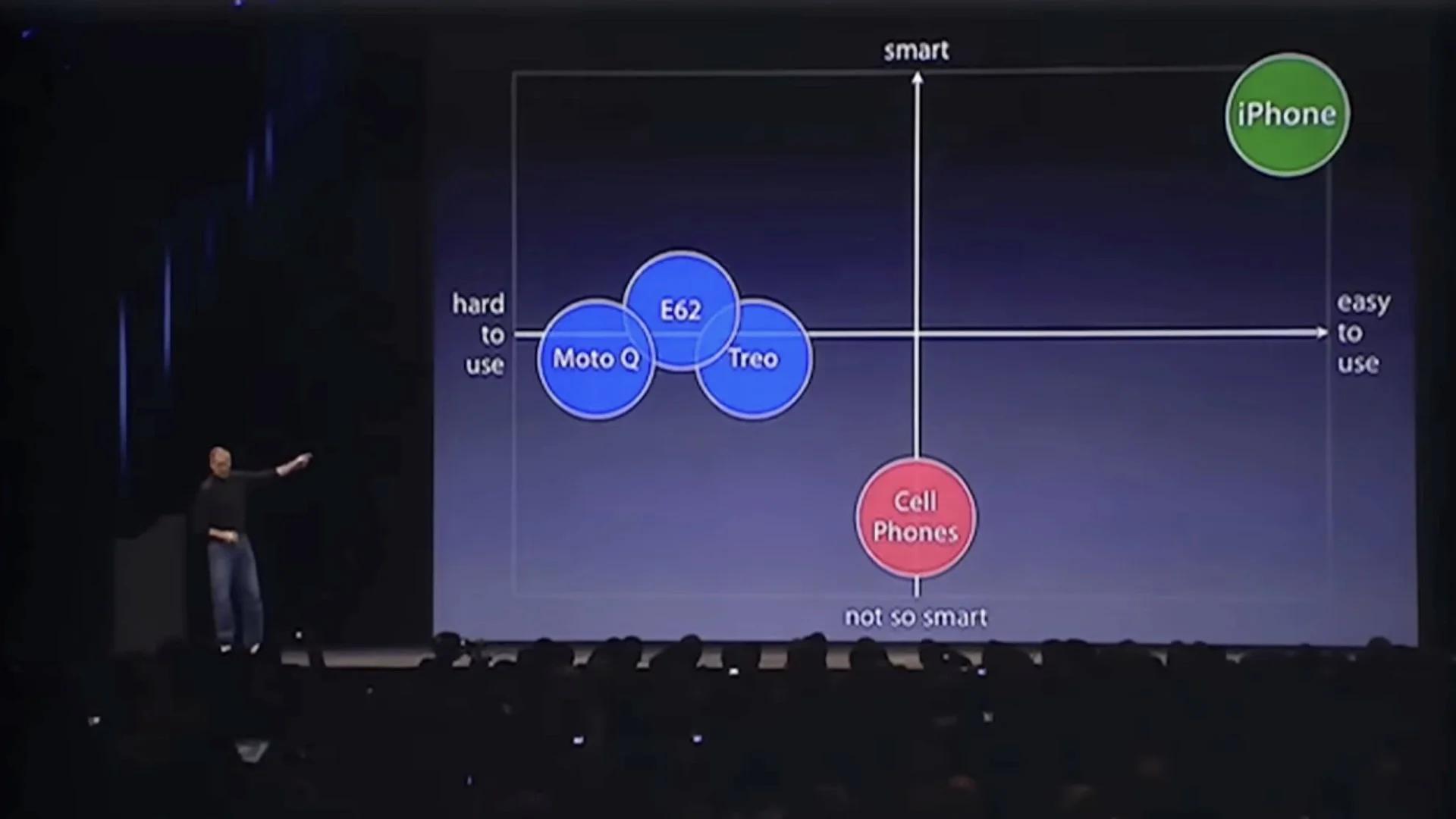
When designing our presentations and creating the supporting visuals, we should keep in mind the way our audience will actually process our presentation. We must design our visuals in ways that take advantage of how people process information. As a general rule, then, make slides as simple and visual as possible and limit the about of text. Here I show you how Steve Jobs used simple, clean, and visual slides—not bullet points—to take people on a journey from the stage.

Steve Jobs & the Zen Aesthetic on Stage
A key tenet of the Zen aesthetic is kanso (簡素) or simplicity. In the kanso concept beauty, grace, and visual elegance are achieved by elimination and omission. Says artist designer and architect Dr. Koichi Kawana, "Simplicity means the achievement of maximum effect with minimum means." When you examine your visuals, then, can you say that you are getting the maximum impact with a minimum of graphic elements, for example? When you take a look at Steve’s slides and Bill’s slides from 2005, how do they compare for kanso? Often, the question is not what can you add, but what can you remove, or resist adding in the first place. Always ask yourself whether the old refrain “less is more” can be applied to your particular visual.
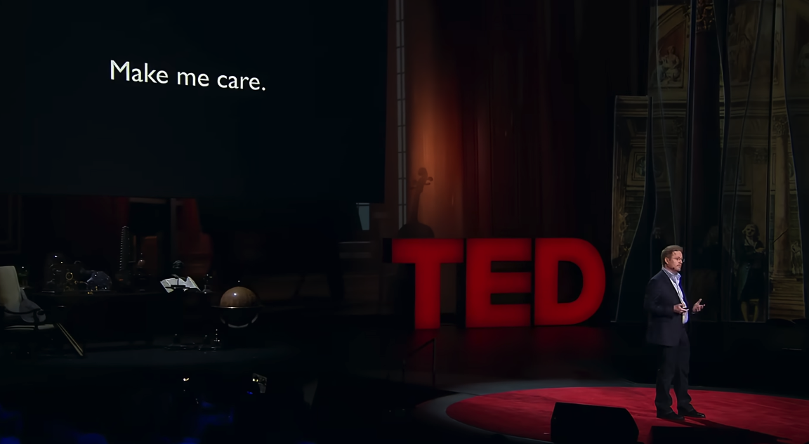
The #1 Storytelling Secret: Make Them Care
Pixar Studios filmmaker Andrew Stanton gave a great TED talk where he stated that the key aim of any good story is that it must make the audience care. The greatest story commandment of all says Stanton is: "Make me care. Please—emotionally, intellectually, aesthetically — just make me care.” If you research the advice of famous directors and screenwriters of today and of years gone by you will find this is a common refrain: You have got to make the audience care.
We are emotional beings, like it or not. To connect and engage people—enough that they care to listen, let alone remember your message—you must first evoke some kind of emotion in them.
The TED talk below is well worth watching; the storytelling lessons in this short talk are many. In this post, I highlight some of the more salient points Stanton makes concerning story.
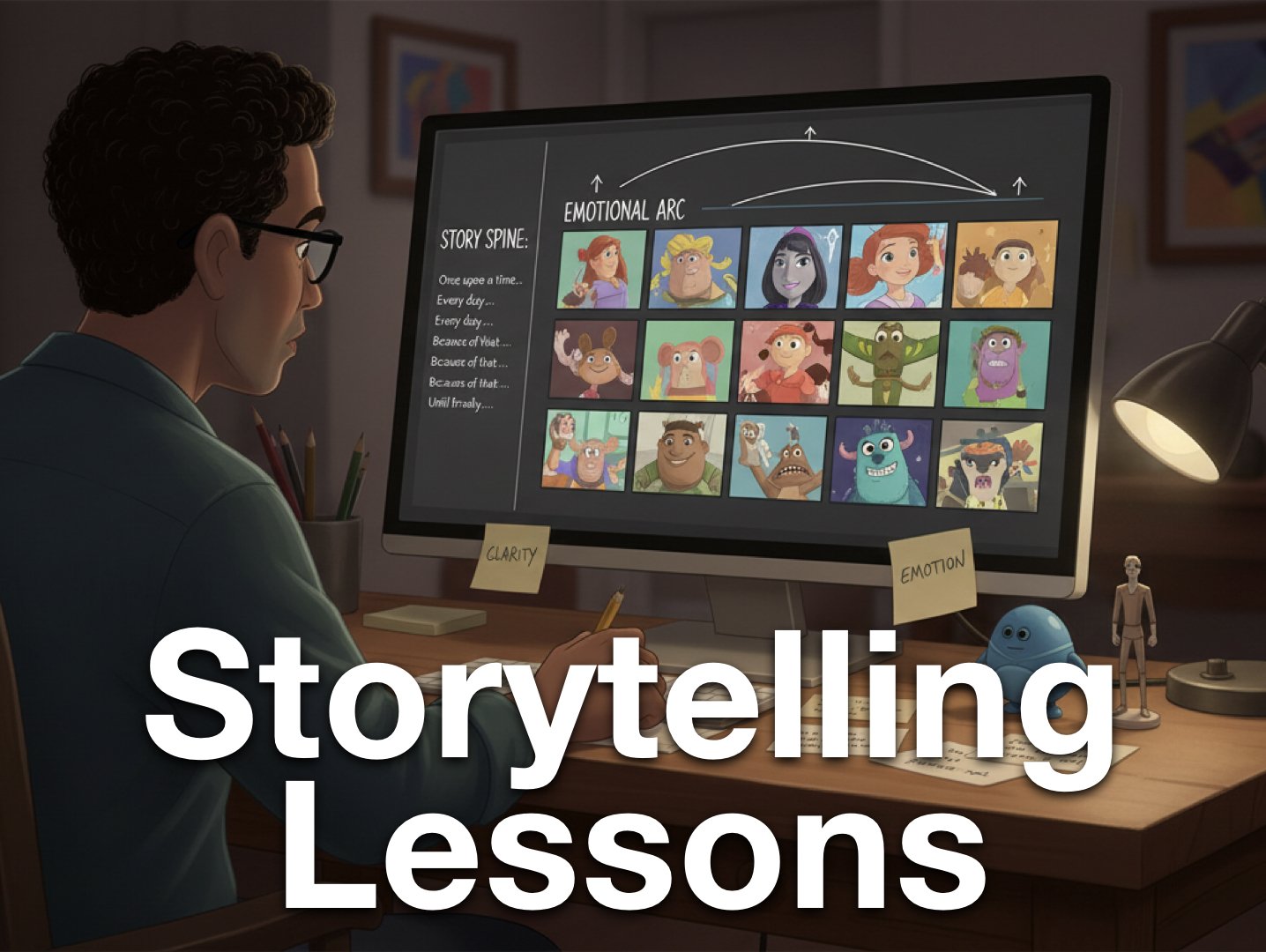
Pixar Studios *Still* Offers Free Storytelling Lessons Online
Pixar-in-a-Box has been offered for free since 2015, and in a world of ubiquitous generative AI, it’s more important than ever to have a deeper understanding of storytelling and visual communication. This is an amazing free resource for those willing to take the time to learn from its offerings. Subjects have included color science, animation, effects, sets & staging, character modeling, and so on. Part of the aim of this project, as stated on the Pixar-in-a-Box website is to show how "The subjects you learn in school — math, science, computer science, and humanities — are used every day to create amazing movies at Pixar."
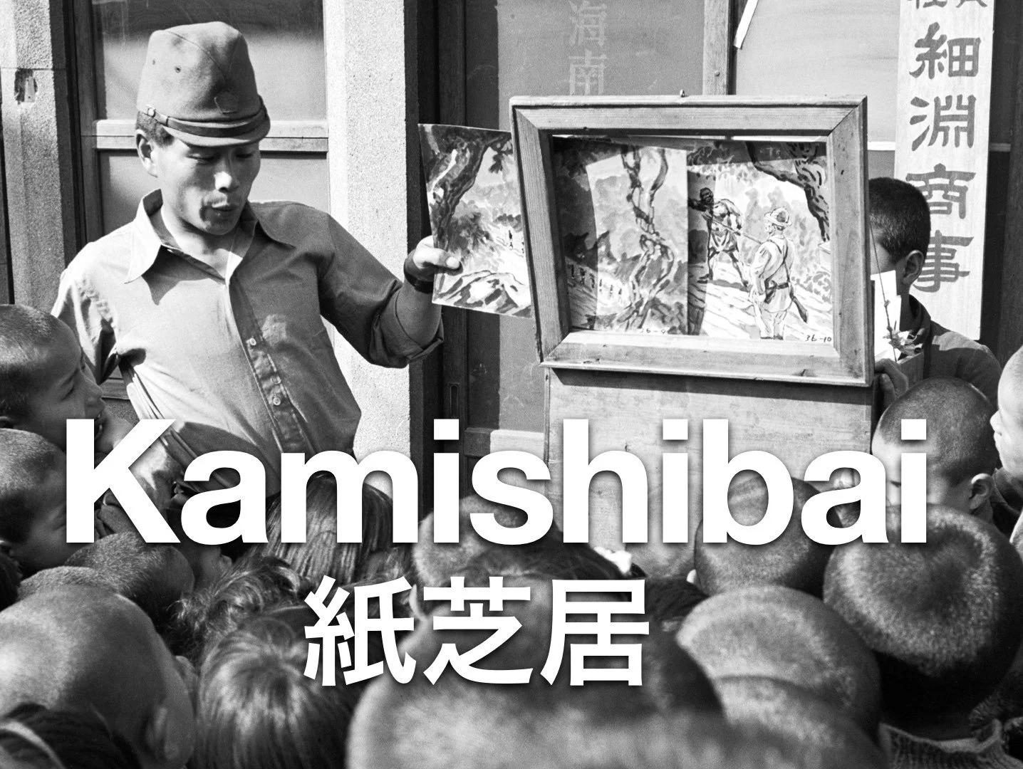
Kamishibai: Lessons in Visual Storytelling and Presentation from Japan
Kamishibai is a form of visual and participatory storytelling that combines the use of hand drawn visuals with the engaging narration of a live presenter. Kami (紙) means paper and shibai (芝居 ) means play/drama. The origins of kamishibai are not clear, but its roots can be taced back to various picture storytelling traditions in Japan such as etoki and emaki scrolls and other forms of visual storytelling which date back centuries. However, the form of Kamishibai that one thinks of today developed around 1929 and was quite popular in the 30s, and 40s, all but dying out with the introduction of television later in the 1950s. Typical kamishibai consists of a presenter who stands to the right of a small wooden box or stage that holds the 12-20 cards featuring the visuals that accompany each story. This miniature stage is attached to the storyteller’s bicycle. The presenter changes the card, varying the speed of the transition to match the flow of the story he is telling. The best Kamishibai presenters do not read the story, but instead keep eyes on the audience and occasionally on the current card in the frame.