The Signal-to-Noise Ratio: Activity
The signal-to-noise ratio (SNR) originally referred to the ratio of a radio signal transmitted through a device to the noise created within the device itself. But with graphic design or presentation design, we can think of the signal-to-noise ratio (sometimes referred to as Signal vs. Noise) as a measurement of the actual message/information we want to convey (signal) compared to irrelevant or distracting elements (noise). So when we are aiming to improve a design, we need to be clear about what the essential elements are and what, if any, are the extraneous elements that we can eliminate.
A common refrain is “less is more.” And while this is not always true, usually when we remove elements that we realize are not actually essential, the design will become clearer or have more impact. Reducing noise in slides or posters means carefully curating content, using visuals to illustrate or amplify ideas rather than repeat them, and designing layouts that enhance—rather than overwhelm—your own storytelling. The audience’s journey through your presentation should feel natural and focused on the information and the facts as well as your own insights and perspectives. The visuals, if done poorly with a lot of noise, can actually work against you.
You have limited time and attention from your audience in a presentation. All the more reason why elimination of the non-essential is critical. Every slide, word, and image should amplify the core message—the signal. Noise comes in many forms: dense text, redundant bullet points, distracting animations, or irrelevant visuals,, distracting logos, etc.

Students have just returned and are sending their examples to my computer for display on the large screen.
Activity to reinforce the lesson
In my own university teaching (pictured here), after a short explanation and discussion of the SNR concept, I have students take their smartphones outside of the classroom and walk around the building in small groups and take photos of what they think are good examples of visuals design (a sign or poster, etc.) and also what they think are poor examples of design, specifically in the context of the SNR concept. Our building has many posters, signs, and bulletin boards so there are a plethora of examples to choose from in the same building. After about 5-10 minutes, students come back and then send me examples their photos Airdrop (or Google Drive) to my computer so I can display the examples for the class. Then, as I display each example, the students who took the photo explain why they think it is a good or a rather noisy design.

The building is full of bulletin boards with plenty of real-world good and bad examples for students to critique.
This activity gives students a break from sitting, of course, but more importantly it provides them the opportunity to immediately use the new information they’ve just learned and discussed in class, apply it (as they look for good/poor examples from the real world), and then share their own thinking about the examples they chose. As they critique their examples, they are also using the concepts they have learned previously in class such as contrast, hierarchy, focal point, and so on.
Examples
Below are a couple of sample Before/After slides. To make the slides clearer, I removed elements like unnecessary lines, logos, text, and superfluous images
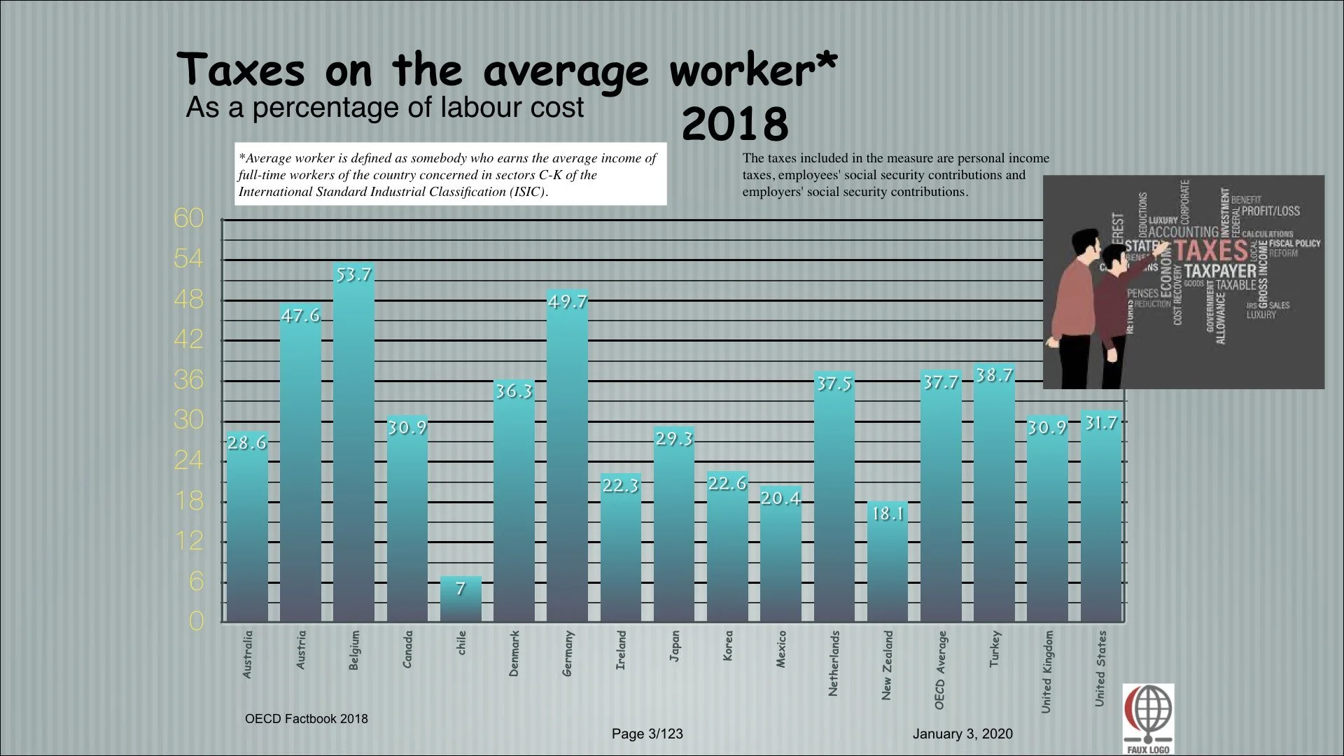
BEFORE (1)
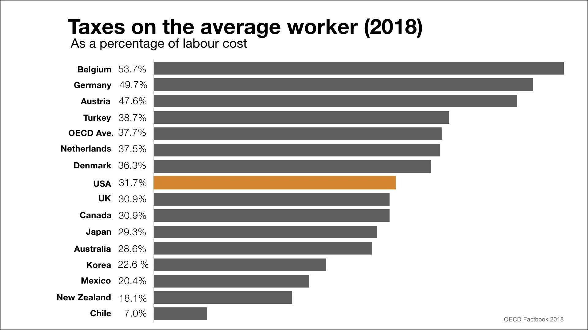
AFTER (1)
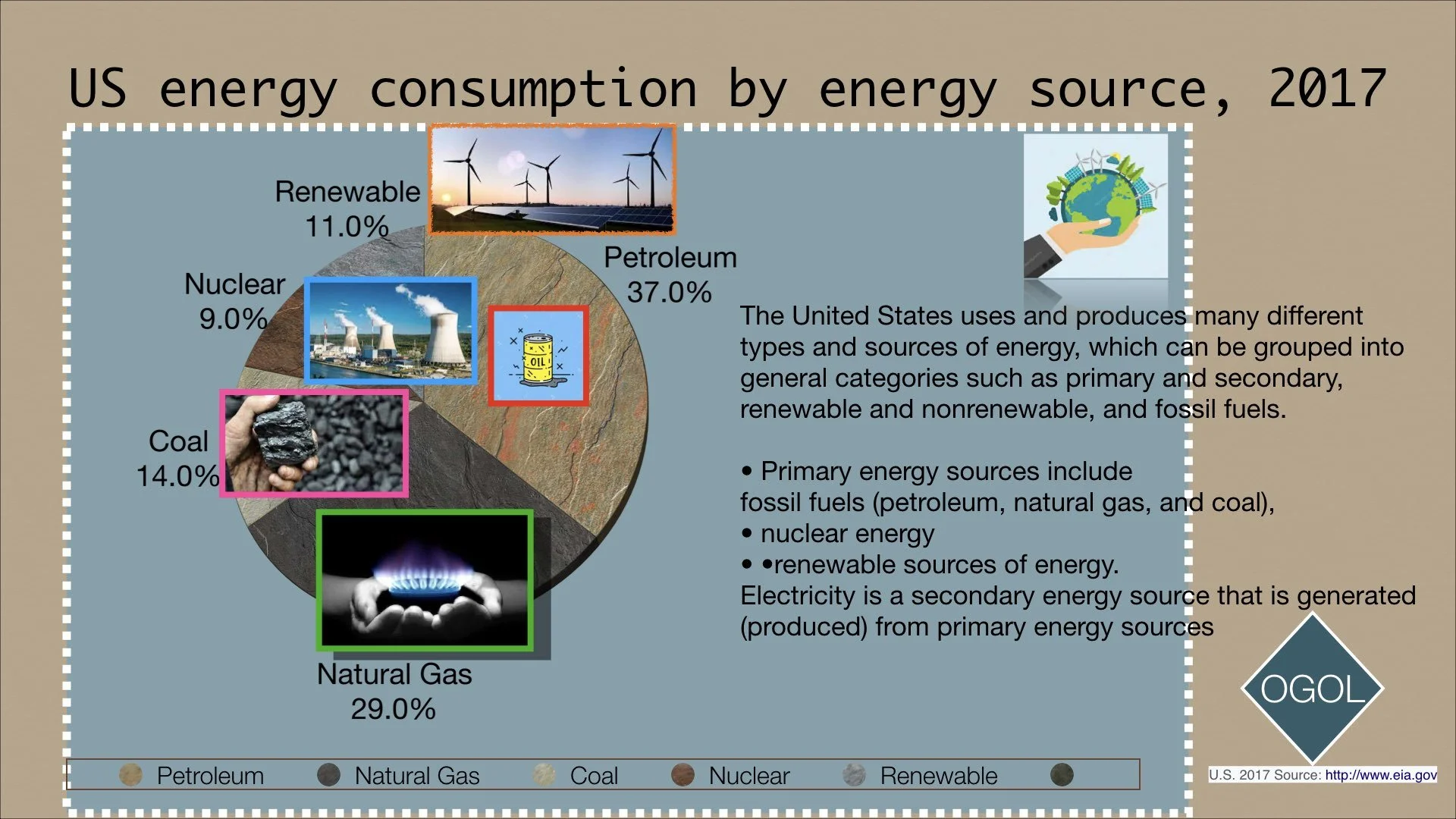
BEFORE (2)
AFTER (2)