Present with Simple Visuals, Not Dense Text

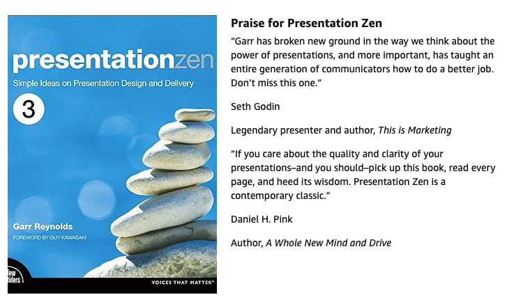
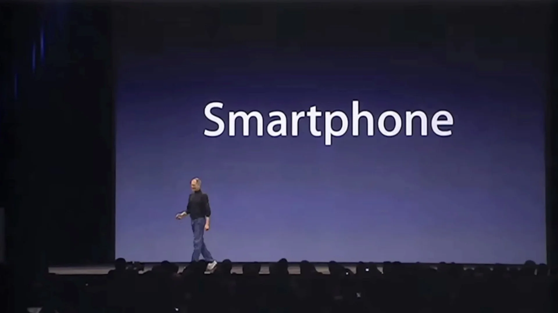
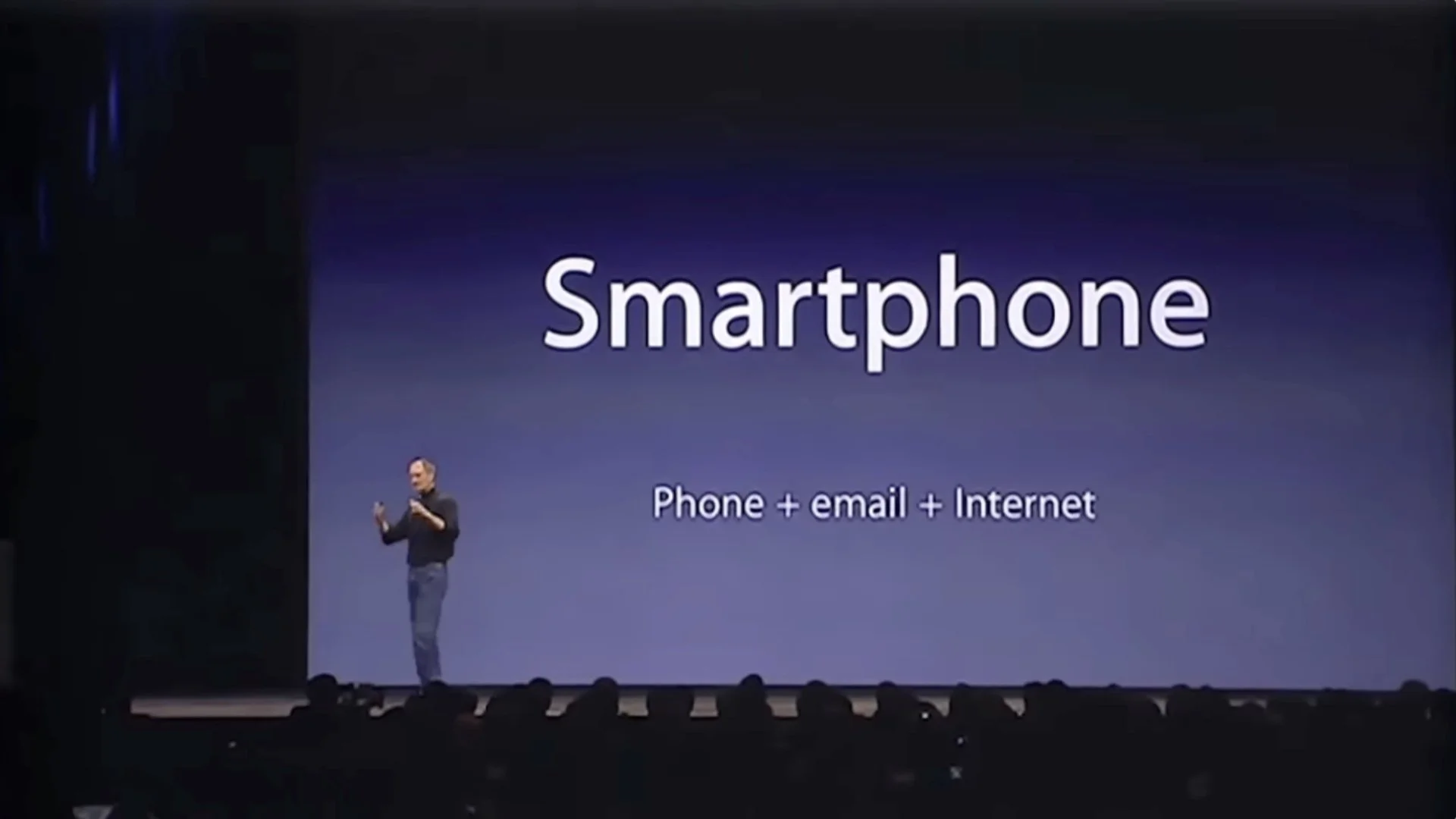
Steve Jobs’s 2007 iPhone introduction keynote was one of his best. In the early part of the presentation, there is a 70-second portion that illustrates how using simple visuals—such as a clear chart—rather than bullet points can amplify the presenter’s message and make it easier for the audience to understand and to remember the core points. Over the short 70 seconds, the visuals on the screen changed nine times over three different slides. So in effect, nine different screens appear if you count the animation builds. Below is the entire keynote on YouTube. The section I’m referring to begins at 3:27.
What’s wrong with text-heavy slides?
This 70-second segment features a simple positioning-matrix chart that illustrates Jobs’s point (that smartphones at that time were neither very smart or easy to use). Using a simple chart like this aligns with John Sweller’s Cognitive Load Theory and Richard Mayer’s multimedia principle, which suggest presenters can make their narration more effective by pairing it with clear, relevant visuals, which help to reduce extraneous cognitive load on the audience. On the other hand, slides which contain loads of text that essentially repeat the spoken narration—or even expand on the narration—are far less effective. When you present with visuals—diagrams, charts, images—your audience learns more effectively when you speak the explanation rather than asking them to read text on the screen while processing the image simultaneously. Also, when you speak while showing a visual, you're distributing the cognitive load across two independent channels: auditory (your words) and visual (the image). But when you crowd the slide with both images and text, you force everything through the visual channel alone.
“It is effective to speak to a diagram, because it presents information in a different form. But it is not effective to speak the same words that are written, because it is putting too much load on the mind and decreases your ability to understand what is being presented.”
When designing our presentations and creating the supporting visuals, we should keep in mind the way our audience will actually process our presentation. We must design our visuals in ways that take advantage of how people process information. As a general rule, then, make slides as simple and visual as possible and limit the about of text.
Narration & visuals
Below are the nine variations of the screen next to or behind Jobs, along with the words he was speaking at the time the particular visual was projected.
“Let me talk about a category of things… the most advanced phones are called smartphones…so they say…”
“…and they typically combine a phone plus some email capability—plus they say it's the internet, sort of the baby internet—into one device…”
“…and they all have these plastic little keyboards on them.”
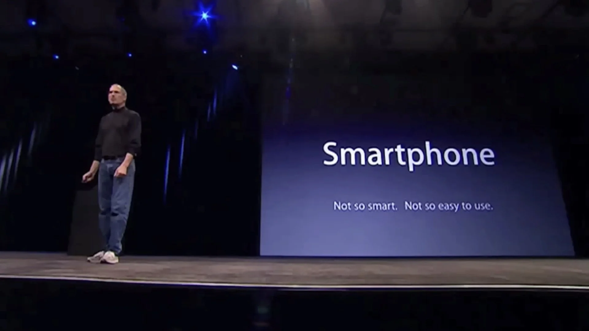
“And the problem is that they're not so smart and they're not so easy to use.”
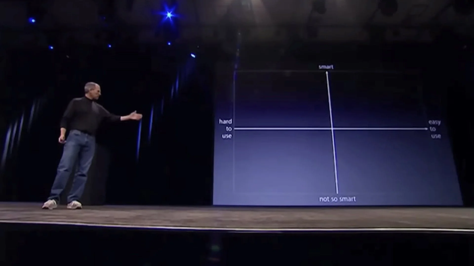
“So if you kind of make a you know business school 101 graph with a smart access and the easy to use access…”
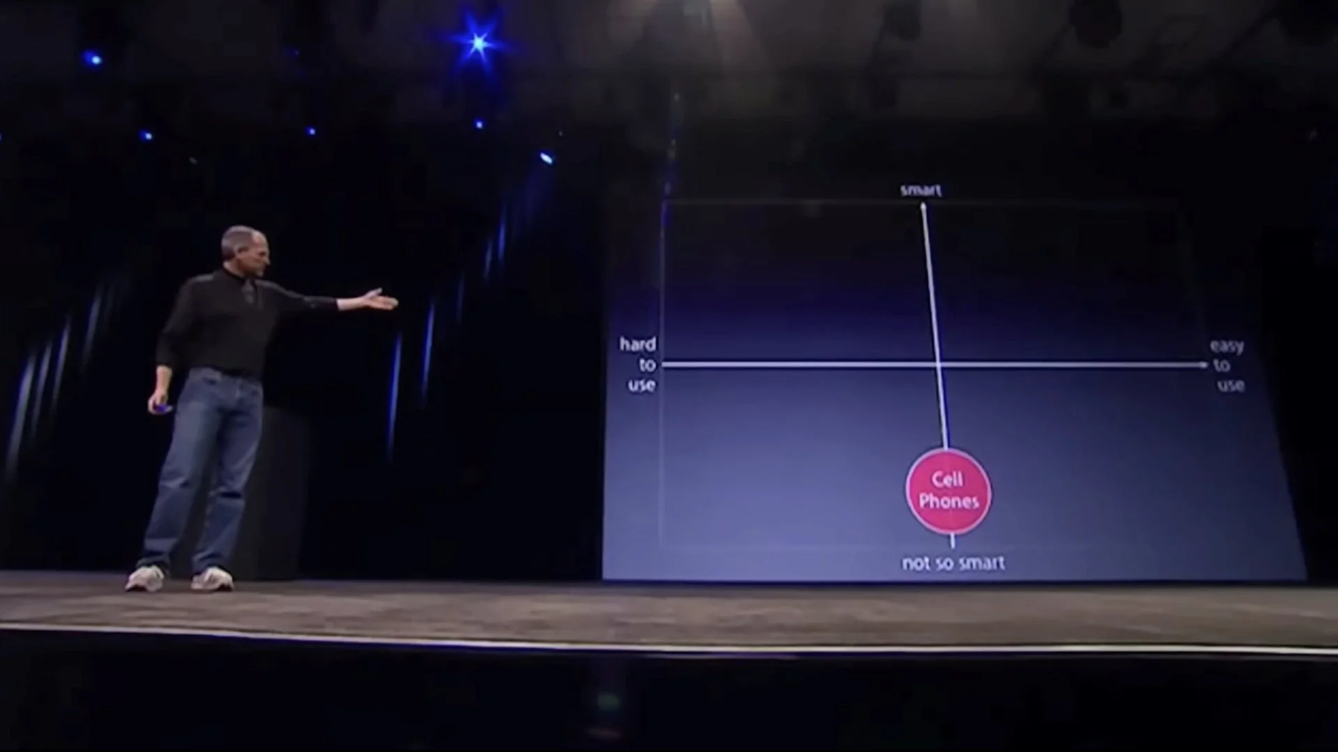
“Phones, regular cell phones, are kind of right there. They're not so smart and they're, you know, not so easy to use.”
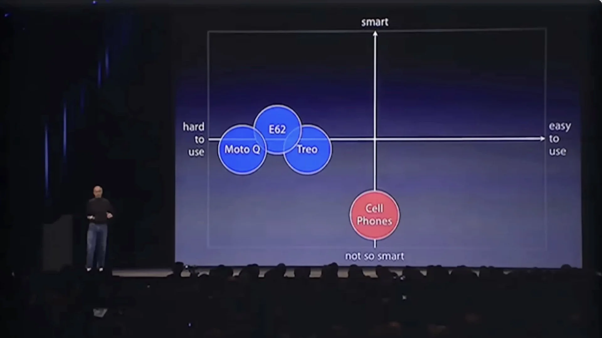
“But smartphones are definitely a little smarter, but they actually are harder to use—they're really complicated. Just for the basic stuff people have a hard time figuring out how to use them.”
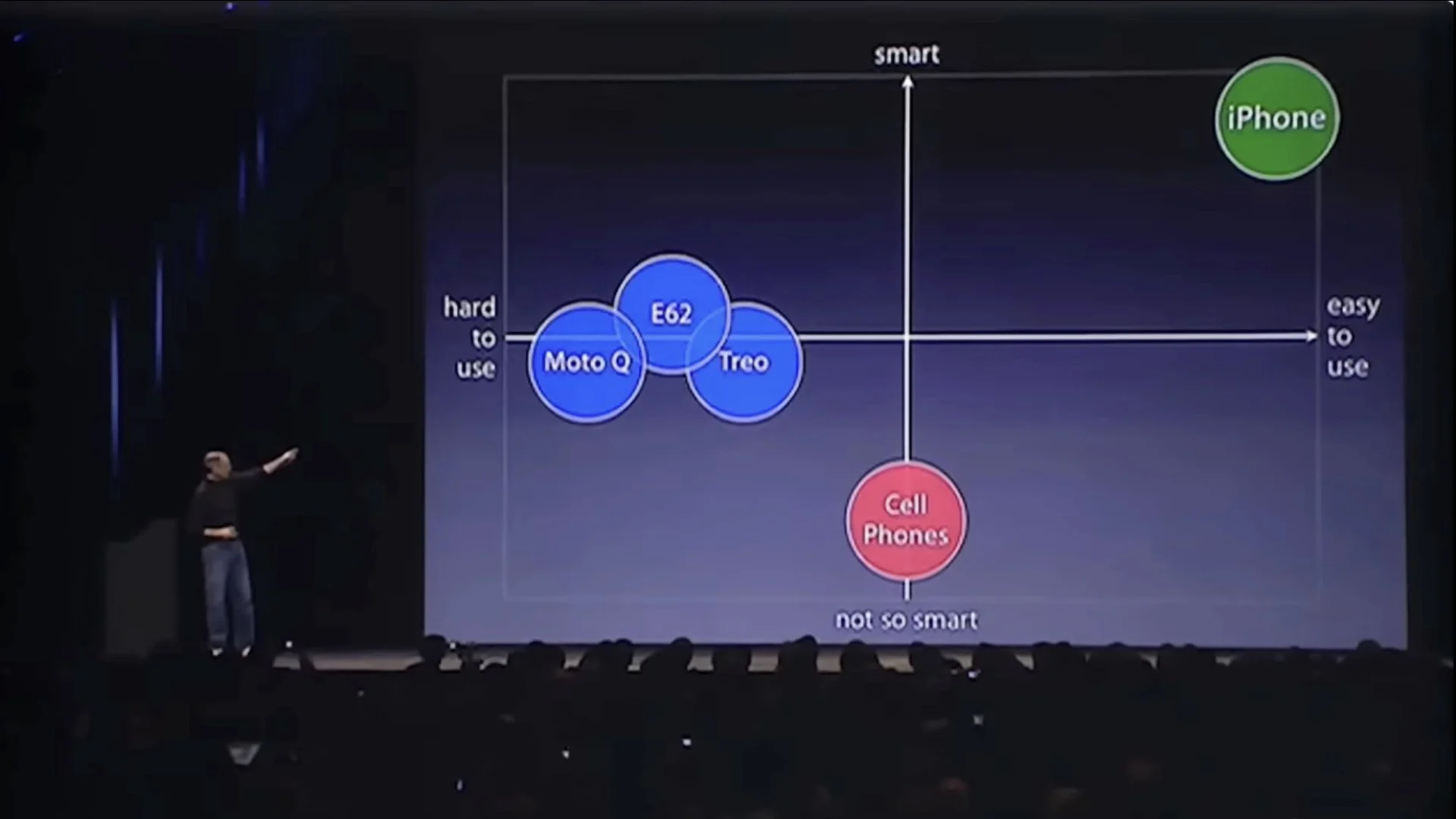
“Well we don't want to do either one of these things. What we want to do is make a leapfrog product that is way smarter than any mobile device has ever been and super easy to use. This is what iPhone is.”
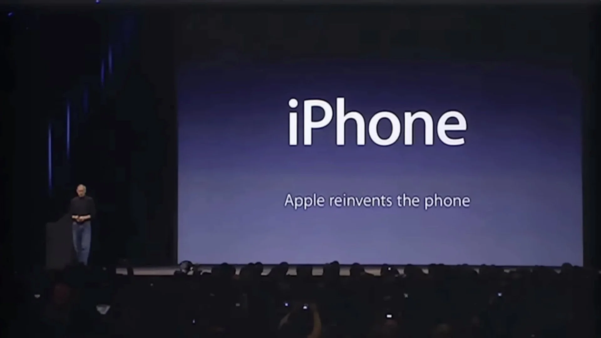
“So, we’re going to reinvent the phone.”
Uncluttered vs visually noisy
Let’s look at the nine slides that appeared over those 70 seconds all in one frame and compare these visuals to the way a lot of people still—believe it or not—create text-heavy slides to go along with their talk.
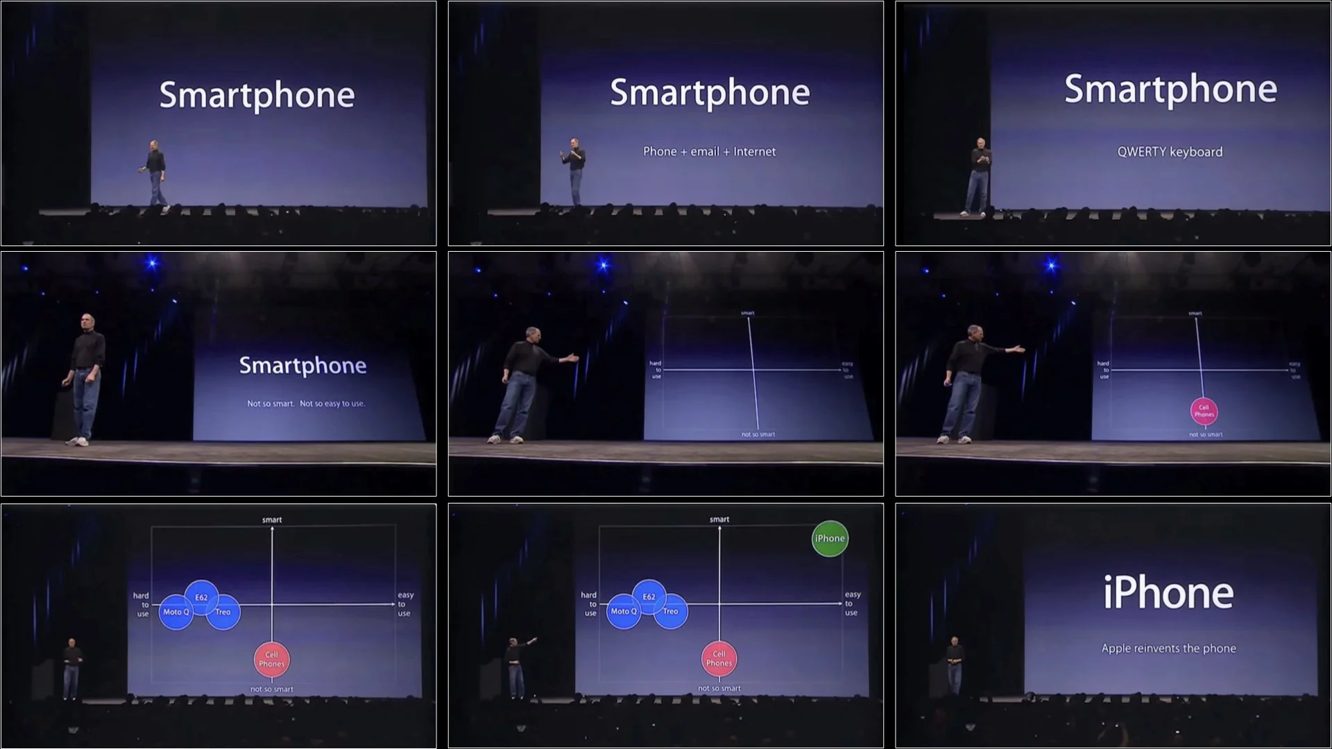
Above: Steve Jobs’s slides over a 70-second segment. People can view visuals like this and listen well at the same time.
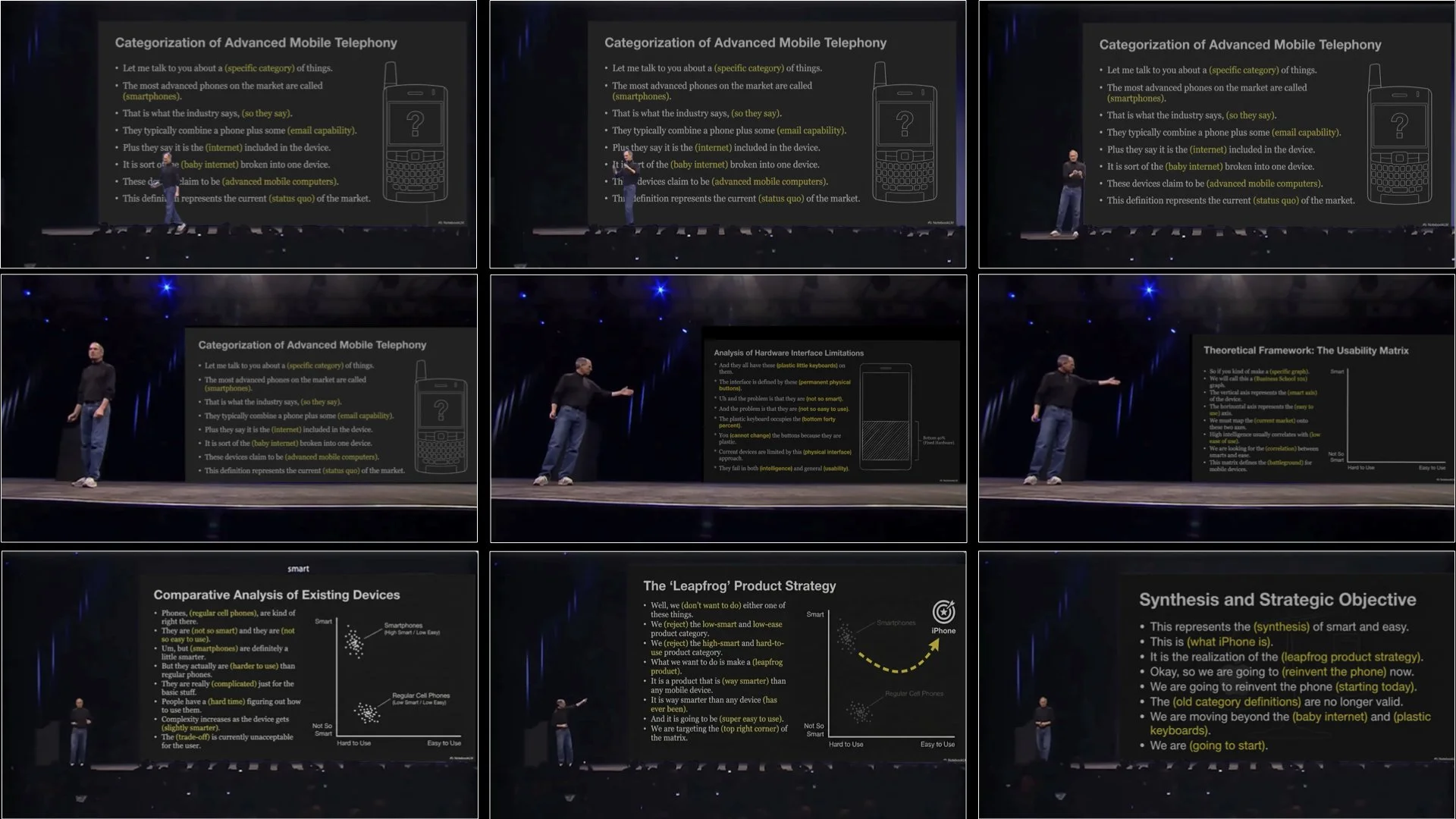
Above: An alternative approach (not recommended). If, hypothetically, Jobs’s had used the slides to repeat what he was saying, this would be an example of extraneous information which could make it harder for the audience to understand and remember the content.
Above: This is a edited version of Steve Jobs’s narration. I replaced the video with a GIF I made in Keynote. An example of the ol’ “PowerPoint method” of presenting at a conference.
Keep it visual
Good presentation techniques, and even classroom instruction methods, are as much art as science. Still, we can learn a lot from examining the findings from researchers such as Sweller and Mayer. Most of us know intuitively (or through experience) that presenting to an audience with text-filled slides does not work, but others—your boss perhaps—may need more convincing. This is where the research and evidence from specialists in psychology, education, and other disciplines can be a great help. Research shows that visuals plus concise, simultaneous narration is better than just narration alone. But when it comes to the issue of projected text on a screen and narration, Mayer draws this conclusion:
“Words should be presented as speech (i.e., narration) rather than text (i.e., on-screen text) or as speech and text.”
— Richard Mayer
Here are two books I recommend. John Sweller’s original book is excellent, but it may be too expensive at the moment. So instead, I suggest Oliver Lovell’s Sweller’s Cognitive Load Theory in Action. The other book that I have been recommending for years is Multimedia Learning by Richard Mayer. Both books are great for educators of all kinds, but you do not have to be in education to find loads of practical implications in these books.
In the video below, I talk about this 70-second section from the iPhone Keynote.