Steve Jobs & the Zen Aesthetic on Stage
In one of my earliest blog posts in November 2005, (YouTube was just getting started then; blogs were the popular thing) I wrote a post entitled “Gates, Jobs, & the Zen aesthetic.” This post went viral and helped propel the original Presentation Zen blog forward. Here in 2026, I’m including much of that original post in hopes that it may be still be useful. A version of these observations also appear in the book Presentation Zen.
Steve Jobs passed away in 2011, and Bill Gates today does not present as much as he did back in his Microsoft days. But as I stated many years ago, I believe we can use many of the concepts found in Zen and Zen aesthetics to help us compare those two different approaches to presentation visuals as well as help us improve our own visuals and presentation techniques.
Design matters
Steve Jobs's presentations generated a lot of buzz and always released another wave of viral communication about the presentation's content. This happened in part because the contents were easily grasped and remembered by both the media, and regular customers and fans. You can't "spread the word" if you don't get what the word is. With Jobs's public presentations, there was both verbal and visual clarity. This is what great leaders do. Ben McConnell and Jackie Huba, authors of Creating Customer Evangelists make a good observation about Jobs: "Jobs does just what a leader is supposed to do: Provide a vision of where the company ship is headed and make sure everyone understands it."
If you’re going to get up on stage and say that the design of your strategy matters, that the design of your software matters, then at the very least the visuals you use — right here and right now, at this moment in time with this particular audience — also need to be the result of thoughtful design, not hurried decoration or something generated at the touch of a button by AI.
Simplicity
A key tenet of the Zen aesthetic is kanso (簡素) or simplicity. In the kanso concept beauty, grace, and visual elegance are achieved by elimination and omission. Says artist/designer and architect Dr. Koichi Kawana, "Simplicity means the achievement of maximum effect with minimum means." When you examine your visuals, then, can you say that you are getting the maximum impact with a minimum of graphic elements, for example? When you take a look at Steve Jobs’s slides and Bill Gates’s slides from 2005, how do they compare for kanso? Often, the question is not what can you add, but what can you remove, or resist adding in the first place. Always ask yourself whether the old refrain “less is more” can be applied to your particular visual.
"Simplicity means the achievement of maximum effect with minimum means."
— Dr. Koichi Kawana
Empty space
There are two different yet related design concepts concerning to how we can think about the idea of space and emptiness: Ma, and Mu.
Ma (間) means space or gap or interval. It’s a way of looking at negative or empty space not as something without meaning or importance, but rather as an element (on a page or slide or in a room, etc.) that serves a subtle but vital purpose. Space between elements—or allowing objects room to breath—can help make designs easier to understand. This idea of space can be applied to speaking or speech-making as well such as with silent pauses that are used to emphasize or clarify. In music, space between notes and intervals of silence in the piece can enhance the quality or emotional impact of the music. In a great jazz performance, much of the power of the music comes from the spaces in between the notes. The silence gives more substance and meaning to the actual notes. In a similar way, a blank screen from time to time also makes images stronger when they do appear. You do not want to overpower an audience with a constantly changing screen.
Mu (無) means nothing/nothingness, not, or without. As a noun it may mean nothing or nonexistence either conceptually or philosophically. In everyday language, 無 is often use as part of other words such as 無理 (Muri: impossible; unreasonable or overdoing.) In fact, one of my often-used phrases in Japanese is “無理しないほうがいい” which means something like “take it easy” or “don’t work/study too hard.” I like to think of Mu in the context of design as a way of looking at emptiness/empty spaces as being something meaningful, not merely leftover areas or undecorated spaces. It’s a way of looking at empty space as a key expressive element rather than something without meaning or purpose. In the everyday world or designing visuals, many people feel that it’s necessary to fill every inch of space with something—text, charts, logos, colors...anything!—as a way of showing how serious we are and how hard we worked. Simplicity in general, including leaving loads of intentional empty space, scares a lot of people. I don’t look at emptiness on a page or slide as nothing as the term is used in everyday language, but rather as a powerful something that can be purposefully created and arranged to help the overall message.
Naturalness
The aesthetic concept of naturalness or shizen '(自然) "prohibits the use of elaborate designs and over refinement" according to Kawana. Restraint, then, is a beautiful thing. Talented jazz musicians, for example, know never to overplay but instead to be forever mindful of the other musicians and find their own space within the music and within the moment they are sharing. Graphic designers show restraint by including only what is necessary to communicate the particular message for the particular audience. Restraint is hard. Complication and elaboration are easy...and are common.
The suggestive mode of expression is a key Zen aesthetic. Dr. Kawana, commenting on the design of traditional Japanese gardens says:
"The designer must adhere to the concept of miegakure since Japanese believe that in expressing the whole the interest of the viewer is lost."
— Dr. Koichi Kawana
In the world of slide presentations, then, you do not always need to visually spell everything out. You do not need to (nor can you) pound every detail into the head of each member of your audience either visually or verbally. Instead, the combination of your words, along with the visual images you project, should motivate the viewer and arouse his imagination helping him to empathize with your idea and visualize your idea far beyond what is visible in the ephemeral PowerPoint slide before him. The Zen aesthetic values include (but are not limited to):
Simplicity
Subtlety
Elegance
Suggestive rather than the descriptive or obvious
Naturalness (i.e., nothing artificial or forced),
Empty space (or negative space)
Stillness, Tranquility
Eliminating the non-essential
Gates and Jobs: lessons in contrasts
Take a look at some of the typical visuals used by Steve Jobs and those used by Bill Gates back in the day. As you look at them and compare them, try doing so while being mindful of the key concepts behind the traditional Zen aesthetic.
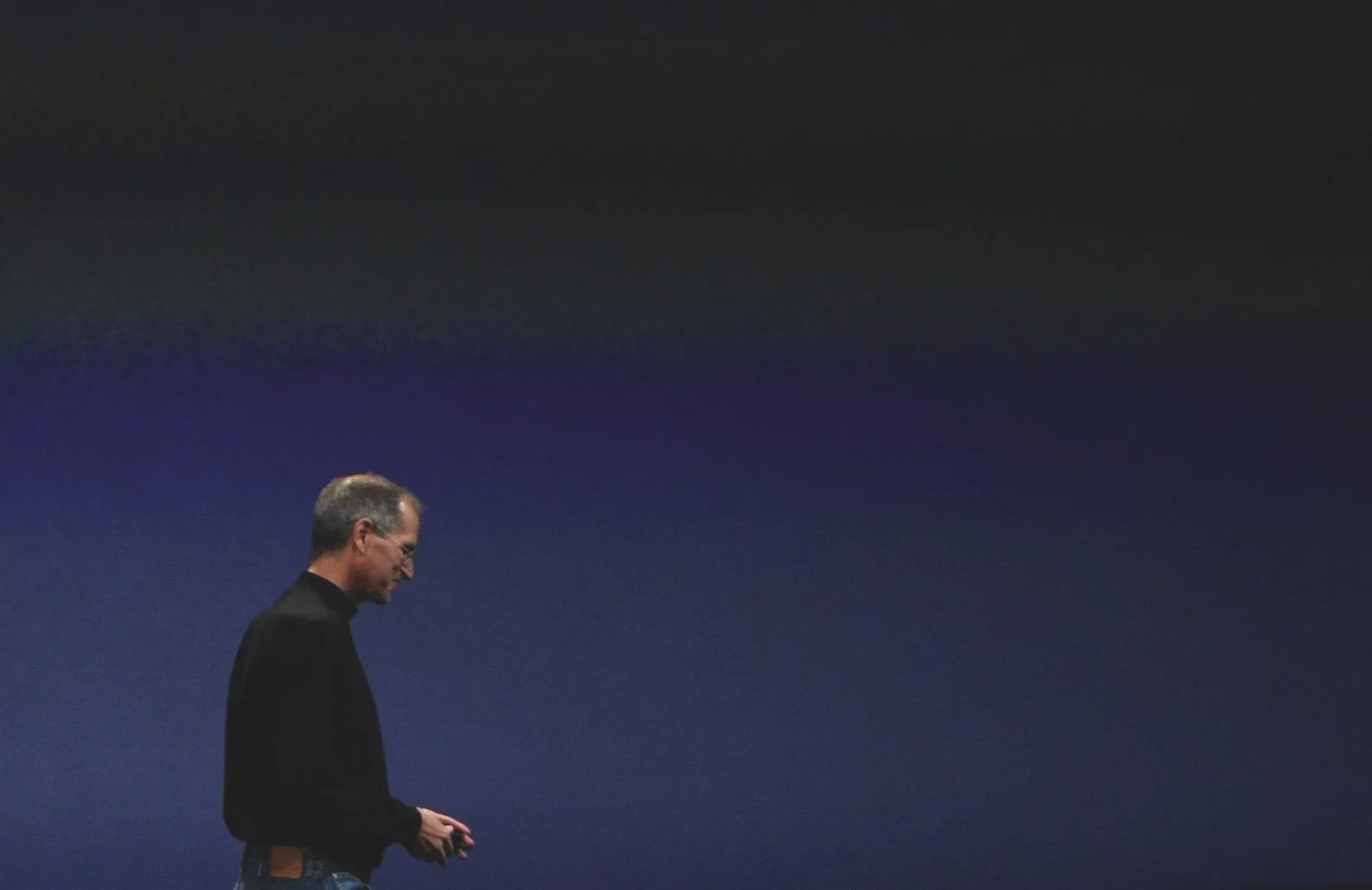
Above. Talk about empty space. The visual-Zen master, Steve Jobs, here allows the screen to fade completely empty at appropriate, short moments while he tells his story.
An empty screen for an interval of time can be a great counterweight of sorts following a series of more rapid-fire or complicated visuals that preceded the empty slide. Moreover, when the screen goes empty it focuses all attention on you, allowing you space to set up the next visual. This also serves to build a bit of tension as the audience anticipates what comes next. It takes a confident person to design for the placement of empty slides. This is truly "going naked" visually. For most presenters a crowded slide is a crutch, or at least a security blanket. The thought of allowing the screen to become completely empty is scary. Now all eyes are on you.
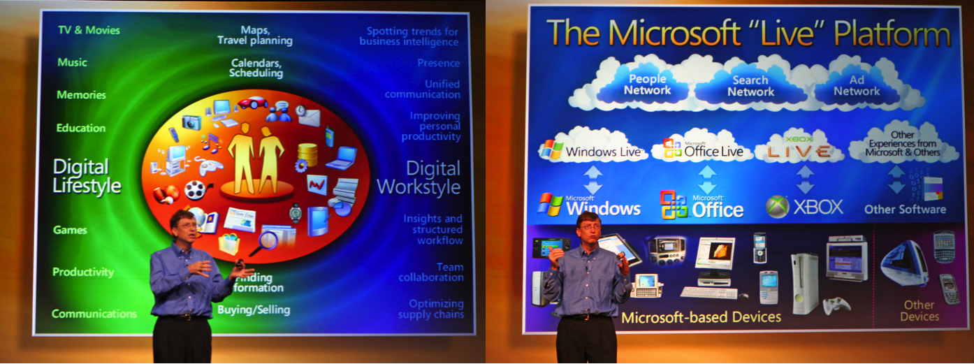
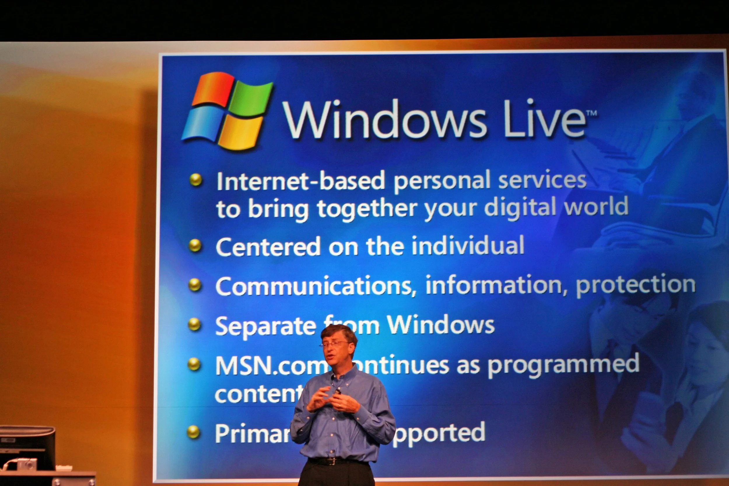
Above. Gates here explaining the Live strategy. A lot of images and a lot of text. In those Microsoft days, Bill’s slides had titles rather than more effective short declarative statements. Good graphic design guides the viewer and has a clear hierarchy or order so that they know where to look first, second, and so on. What is the communication priority of this visual? Gradation is overused; even the text has gradation! Especially when used on text, it makes it hard to read. Overall impression is one of clutter. (Original photo: N. Kennedy)
Dr. Kawana says that "to reach the essence of things, all non-essential elements must be eliminated." So what is the essence of the point being made with the help of this visual above? Are any elements in this slide non-essential? At its core, what is the real point? These are always good questions to ask ourselves, too, when critiquing our own slides.
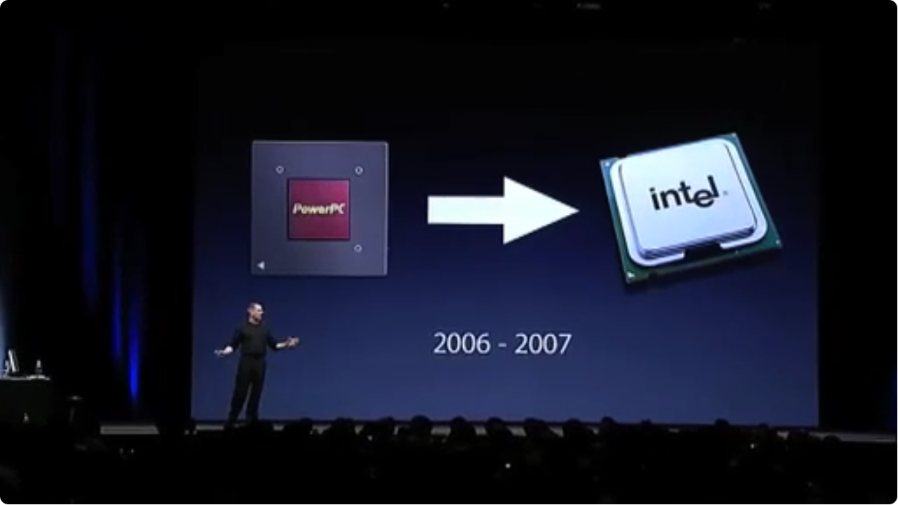
Above. Here Jobs is talking to developers at the WWDC'05 about the transition from the Power PC RISC chips to Intel. Sounds daunting, but as he said (and shows above) Apple has made daunting major shifts successfully before. (He also said sheepishly earlier in the the presentation, that every version of OSX secretly had an Intel version too...so this is not a new thing. The crowd laughed.).
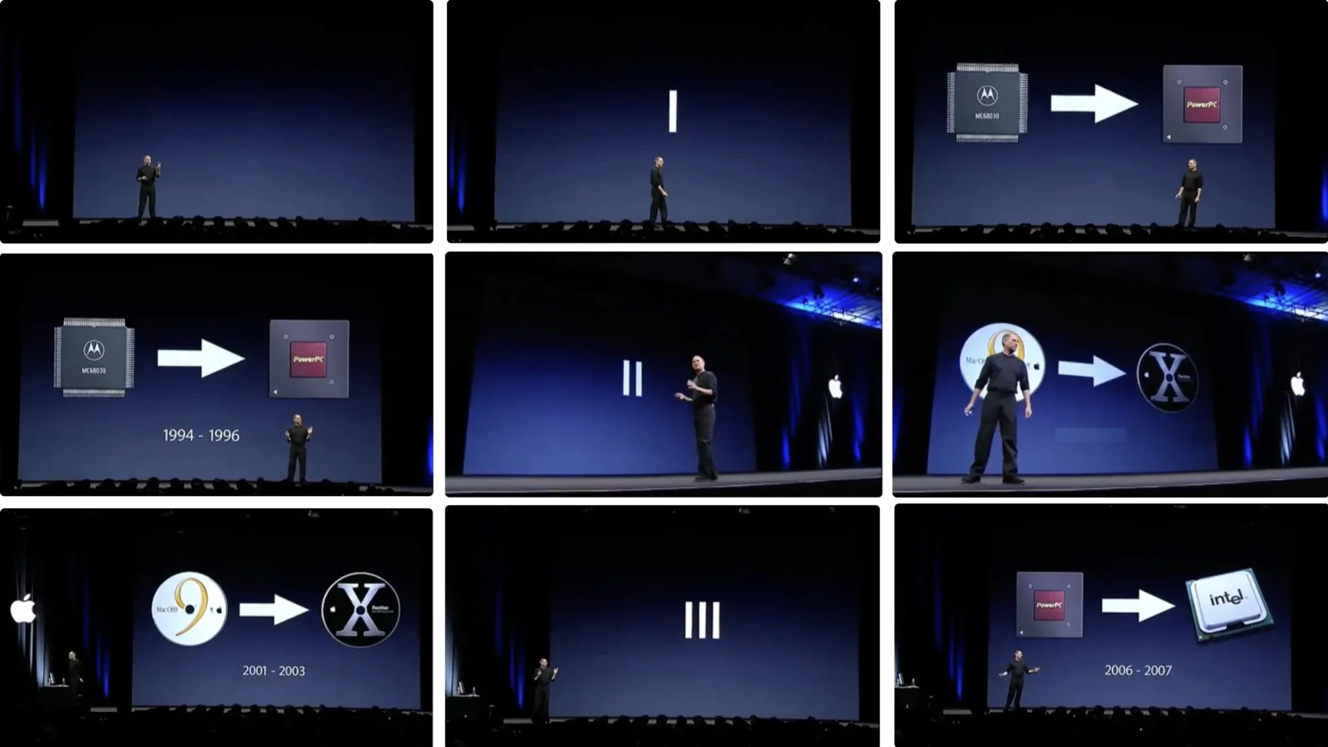
Above. Here your can see the visual simplicity as Jobs takes his audience of developers through (1) the past, (2) the present, and (3) the future of Apple’s CPUs. Rather than a list of bullet points on one slide, he illustrates his words with simple visuals that amplify his narrative as he takes the audience on a little past/present/future journey over several slides. It’s clear where we came from, where we are, and where we’re going.
See how Steve Jobs used the “rule of 3” in this 2005 presentation.
A note on having an "open style"
One thing that would have helped Mr. Gates back then is an executive presentations coach and a video camera. One unfortunate habit he had was bringing his finger tips together high across his chest while speaking. Often this leads to his hands being locked together somewhere across his chest. This gesture makes him seem uncomfortable and is a gesture reminiscent of The Simpsons' Mr. Burns. By contrast, Steve Jobs has a more open, conversational style and at least seems comfortable and natural with his gestures.
Above. Mr. Gates needs to read Cliff Atkinson's Beyond Bullet Points, ironically published by Microsoft Press. Atkinson says that "...bullet points create obstacles between presenters and audiences." He correctly claims that bullets tend to make our presentations formal and stiff, serve to "dumb down" our points, and lead to audiences being confused...and bored. Rather than running through points on a slide, Atkinson recommends presenters embrace the art of storytelling, and that visuals (slides) be used smoothly and simply to enhance the speaker's points as he tells his story. This can be done even in technical presentations, and it can certainly be done in high-tech business presentations.
The old "Microsoft Method" of presentation?
Looking back at this example of Bill Gates vs Steve Jobs presentation styles may seem cringe-worthy now. Surely most professionals and students see the absurdity of that old Bill Gates approach, and indeed Bill Gates himself has improved his presentations over the years. But while Bill may have improved, many presenters today, even (especially?) those who lean on AI to create slides, still make text-heavy, cluttered, and decorative visuals with disconnected, robotic delivery.
Refrain: It all matters!
In this blog and in my books I show many different presentation methods, methods that are different than the normal or the expected, but also simple, clear, and effective. Who wants to be average, typical, or normal? Ridderstrale & Nordstorm say it best in Funky Business: "Normality is the route to nowhere." I'm not suggesting you "present different" for the sake of being different. I am saying that if you move far beyond what is typical and normal in the context of presentation design, you will be more effective and different and memorable. Maybe huge organizations can afford lousy presentations, but you and I can't. For the rest of us, it all matters.
Can we learn from a Japanese garden?
Looking for inspiration in different places? Find a book on Japanese gardens (like this one from my friend, designer Markus Wernli) or visit one in your area (if you are lucky enough to have one). Living here in Japan I have many chances to experience the Zen aesthetic, either while visiting a garden, practicing zazen in a Kyoto temple, or even while having a traditional Japanese meal out with friends. I am convinced that a visual approach which embraces the aesthetic concepts of simplicity and the removal of the nonessential can have practical applications in our professional lives and can lead ultimately to more enlightened design.
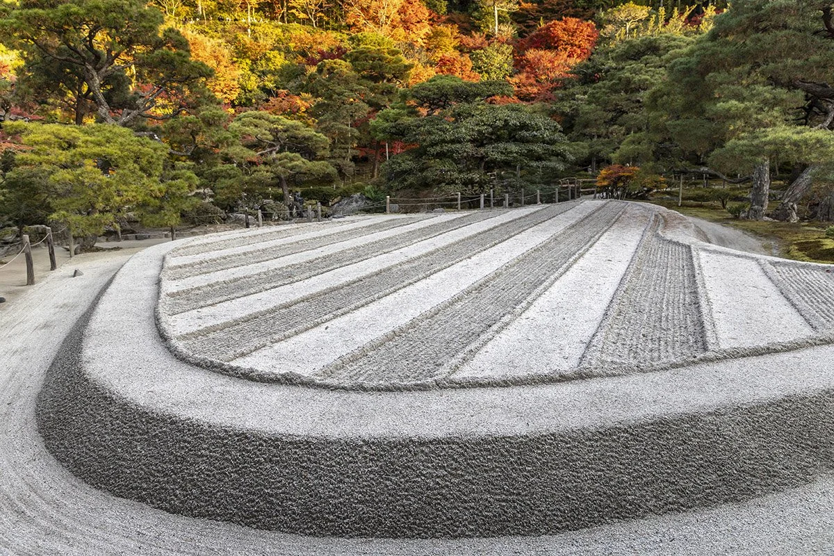
Above: The sand garden at Ginkaku-ji in Kyoto embodies the harmony and simplicity found in natural beauty while also representing its transient and imperfect nature.